The Concentration section of the AP Studio Art portfolio lets an artist pick a certain theme or subject and medium to work on and develop their skills and ideas over the course of 12 pieces.
My concentration is a series of watercolor illustrations depicting the concept of the children’s game, Duck, Duck, Goose as an allegory for the rise of Stalin in Soviet Russia. Everyone in the game, according to traditional rules, is a “duck” at first, all equal, until one is selected as the “goose”, which rises out of the group and chases the selector. The resulting illustrations narrate a visual dynamic of one central duck’s participation in the revolution.
Click on an image to enlarge it.
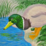
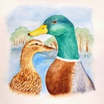
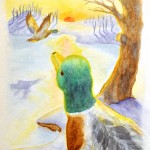
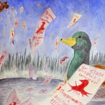
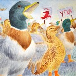
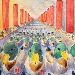
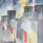
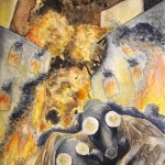
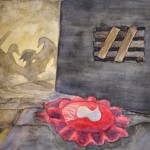
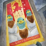
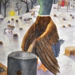
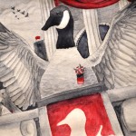
In the first piece, acrylic paint presented challenges as a medium to communicate my desired design choices. I found watercolor to be a much more suitable medium to depict aquatic birds because it allowed for a greater range of transparency and brush techniques. This can be referenced in the way that I was able to layer feathers on the duck’s back in 3 and create the range of opacity that can be seen in the washes in 8. In 3 and 5 I began to expand the range of colors in my palette to communicate a more elaborate scene through light and contrast. In 7 and 8 I used darker values to emphasize the mood of the piece. As the concept behind each piece began to get darker, I echoed this in the use of darker, more neutral colors to create an ominous feeling. My compositions in 8, 9, and 10 were designed to push the point of view in order to make the viewer feel like they are a part of the piece themselves, much like a cinematographer’s storyboard. I was influenced by looking at children’s books such as Tuesday by David Weisner, who anthropomorphizes animals in watercolor. I also used photos of ducks and geese to get the feather patterns and basic figure. Additionally, I took pictures of falling papers and crumpled ribbon for use in 4 and 9. I also looked at pictures of Soviet propaganda for 10, of parades for 6 and of Stalin himself for 12.