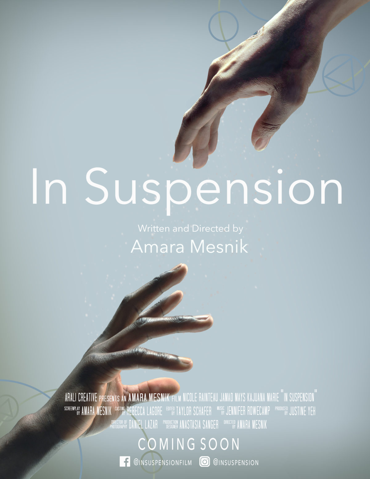
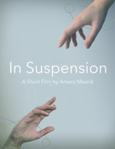
I designed the poster for my upcoming short film, “In Suspension”. I came up with the concept early on, during pre-production, and made a mock-up using my own hands even before we had cast any actors.
I took photos of my own hands and worked them into the concept, all but solidifying the background. I loved the idea of having those shapes– circles for social circles, triangles for the Prism, also just fun design motifs. If you notice, there’s more blue on the top right and more green on the bottom left, even in the gradients– this is to represent the upper and lower strata and the idea that they’re separate wavelengths, split apart by the Prism.
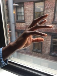
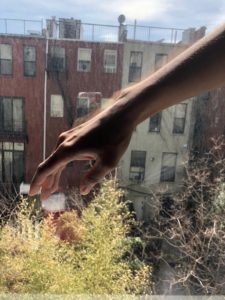
Then, after the production period of the film, I took photos of one of the actor’s hands during a VO session and had the other one send me a picture of her hands. Just iPhone pictures, no fancy lighting– I told them to just hold their hands in front of a window.
I tossed them into PS, shopped out everything but their hands, and played around with color to get them to match the original bluish concept. Here’s the final product!

Now available to make your movie poster, too– shoot me an email if you’re interested!
